 |
uvi-script
Musical event scripting with Lua
|
|
uvi-script
Musical event scripting with Lua
|
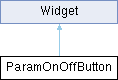
An on/off button bound to an existing boolean Element parameter (e.g. More...
Public Member Functions | |
| ParamOnOffButton (Element elementOrPath, string paramName) | |
| creates an on/off button bound to an existing Element parameter. | |
| ParamOnOffButton (string name) | |
| creates an unbound button, to be targeted later with bind. | |
| void | bind (Element elementOrPath, string paramName) |
| bind the widget to another parameter, or bind an unbound widget for the first time. | |
| void | setNormalImage (string imagePath) |
| same as setting normalImage | |
| void | setPressedImage (string imagePath) |
| same as setting pressedImage | |
| void | setOverImage (string imagePath) |
| same as setting overImage | |
| void | setStripImage (string imagePath, int numFrames) |
| dress the button from one image holding a frame per state, stacked top to bottom in the order off, on, hovered off, hovered on, held off, held on. | |
| void | setLottieAnimation (string path, string mode) |
| dress the button with a Lottie animation. | |
Public Attributes | |
| bool | value |
| the button state (read-only; reflects the bound parameter) | |
| string | normalImage |
| image path for the off state | |
| string | pressedImage |
| image path for the on state, and for the button while held down | |
| string | overImage |
| image path for the mouse being over the button while it is off | |
| string | overPressedImage |
| image path for the mouse being over the button while it is on | |
| string | backgroundColourOff |
| background colour when off | |
| string | textColourOff |
| text colour when off | |
| string | backgroundColourOn |
| background colour when on | |
| string | textColourOn |
| text colour when on | |
| bool | triggeredOnMouseDown |
| fire on mouse-down instead of mouse-up | |
| number | fontSize |
| text font size | |
| string | font |
| path to a custom TrueType font | |
| string | stripImage |
| path to the strip image. | |
| string | lottieAnimation |
| path to a Lottie animation or package, see Lottie Animations | |
 Public Attributes inherited from Widget | |
| string | name |
| widget name, given at construction (read-only) | |
| string | displayName |
| widget display name | |
| string | displayText |
| custom text to display in place of the standard value display, on widgets that show one. | |
| string | tooltip |
| widget tooltip, default is name | |
| int | x |
| x position in pixels | |
| int | y |
| y position in pixels | |
| int | width |
| widget width in pixels | |
| int | height |
| widget height in pixels | |
| int | w |
| alias of width | |
| int | h |
| alias of height | |
| table | size |
| widget size {width, height} | |
| table | position |
| widget position {x,y} | |
| table | pos |
| alias of position | |
| table | bounds |
| widget bounding rect {x,y,width,height} | |
| number | alpha |
| transparency value between 0.0 and 1.0 | |
| bool | enabled |
| boolean flag to enable / disable the widget | |
| bool | visible |
| boolean flag to toggle widget visibility | |
| bool | interceptsMouseClicks |
| boolean flag to toggle mouse handling on widget. | |
| bool | showLabel |
| show widgets label if any | |
| bool | persistent |
| flag to tell if the widget values should be serialized when saving. | |
| function | changed |
| callback function used by child widgets to be notified of changes. | |
An on/off button bound to an existing boolean Element parameter (e.g.
a Bypass toggle). It is a Widget (not an OnOffButton).
| ParamOnOffButton::ParamOnOffButton | ( | Element | elementOrPath, |
| string | paramName ) |
creates an on/off button bound to an existing Element parameter.
| elementOrPath | an Element reference, or a path string identifying one |
| paramName | the parameter name (as used by setParameter) |
| ParamOnOffButton::ParamOnOffButton | ( | string | name | ) |
creates an unbound button, to be targeted later with bind.
Until then it shows a placeholder and its value is nil.
| name | the widget name |
| void ParamOnOffButton::bind | ( | Element | elementOrPath, |
| string | paramName ) |
bind the widget to another parameter, or bind an unbound widget for the first time.
The control is rebuilt with the new parameter's range, unit, mapper and value; rebinding to the same element and parameter does nothing. Typically called when the element the UI edits changes, e.g. the insert effect selected in an effect rack. Raises an error when the element no longer exists or has no such parameter.
| elementOrPath | an Element reference, or a path string identifying one |
| paramName | the parameter name (as used by setParameter) |
| void ParamOnOffButton::setLottieAnimation | ( | string | path, |
| string | mode ) |
dress the button with a Lottie animation.
See Lottie Animations.
| path | path to a .json animation or a .lottie package |
| mode | "toggle" walks the animation on and off, "trigger" replays it from the first frame on every click; any other string reads as "toggle". The argument is required – a call with the path alone raises an error. To keep the toggle mode, assign the lottieAnimation property instead |
| void ParamOnOffButton::setStripImage | ( | string | imagePath, |
| int | numFrames ) |
dress the button from one image holding a frame per state, stacked top to bottom in the order off, on, hovered off, hovered on, held off, held on.
Fewer frames are read as the first few of that order, so a strip may stop wherever the separate images stopped. Supports Retina @2x variants.
| imagePath | path to the strip image |
| numFrames | how many frames the image holds |
| string ParamOnOffButton::stripImage |
path to the strip image.
Nothing is drawn from a strip until the frame count is given, so assigning this alone is inert – call setStripImage